

Case study / Well Planned
Well Planned — expert planning, proven results.
A specialist planning consultancy with deep, hands-on experience across planning applications, appeals and development guidance — helping homeowners, developers and property investors move through the planning process with confidence. Its identity had real expertise behind it that its presentation didn't communicate.
01 — The challenge
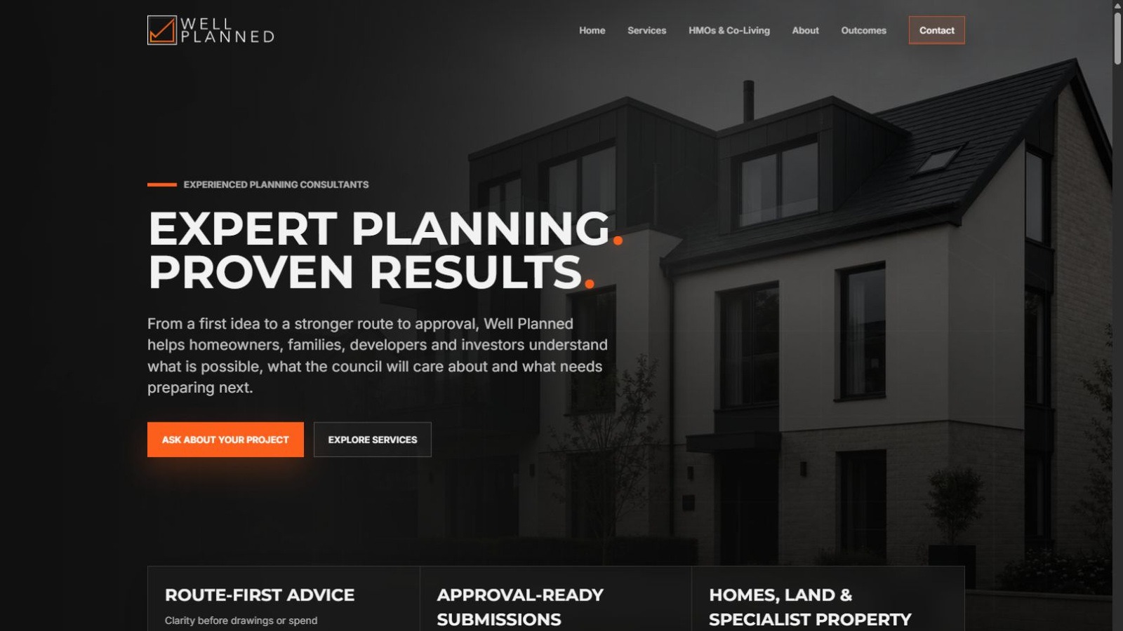
Capable, experienced — hard to read at a glance.
Well Planned's advice was precise and its results were proven, but the outward form didn't say so. Homeowners, developers and property investors weighing up a specialist planning consultancy need to trust the judgement behind it fast — and a brand and website built for an earlier stage of the business were getting in the way of that first impression.
02 — Positioning & identity
Structure, then progress — built into the mark itself.
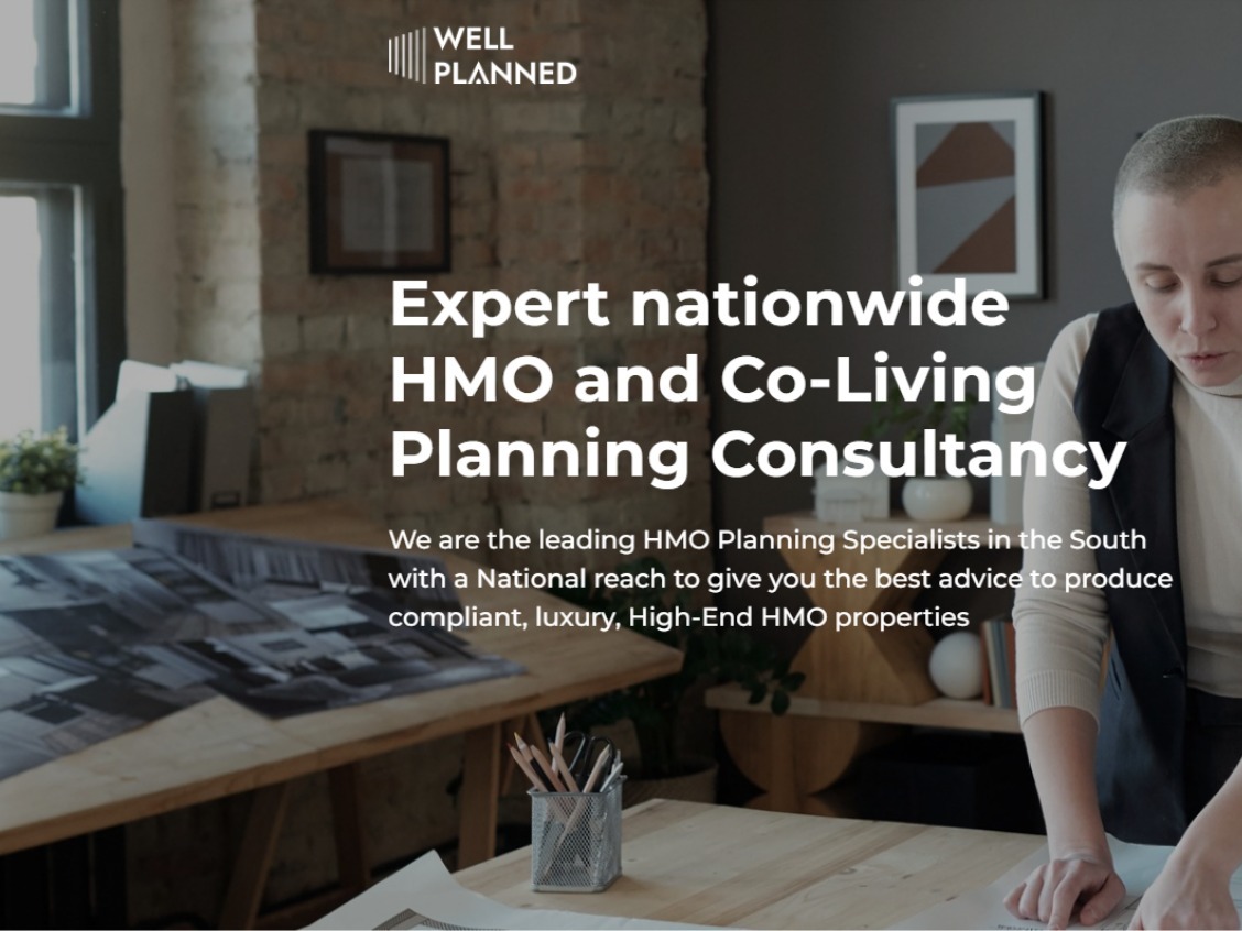
We repositioned Well Planned around the idea already at the centre of its work: planning for approval. The identity now carries that logic directly — a square frame for structure, regulation and control; architectural guideline detail for precision and technical understanding; an orange approval tick, moving upward, for the progress and confidence a client feels the moment a project gets the green light.
Charcoal and off-white keep the system calm, premium and legible; the orange accent is used with restraint, reserved for ticks, calls to action and the moments that matter — never spread thin enough to lose its meaning.

03 — The system in use
Built to hold up everywhere a client sees it.
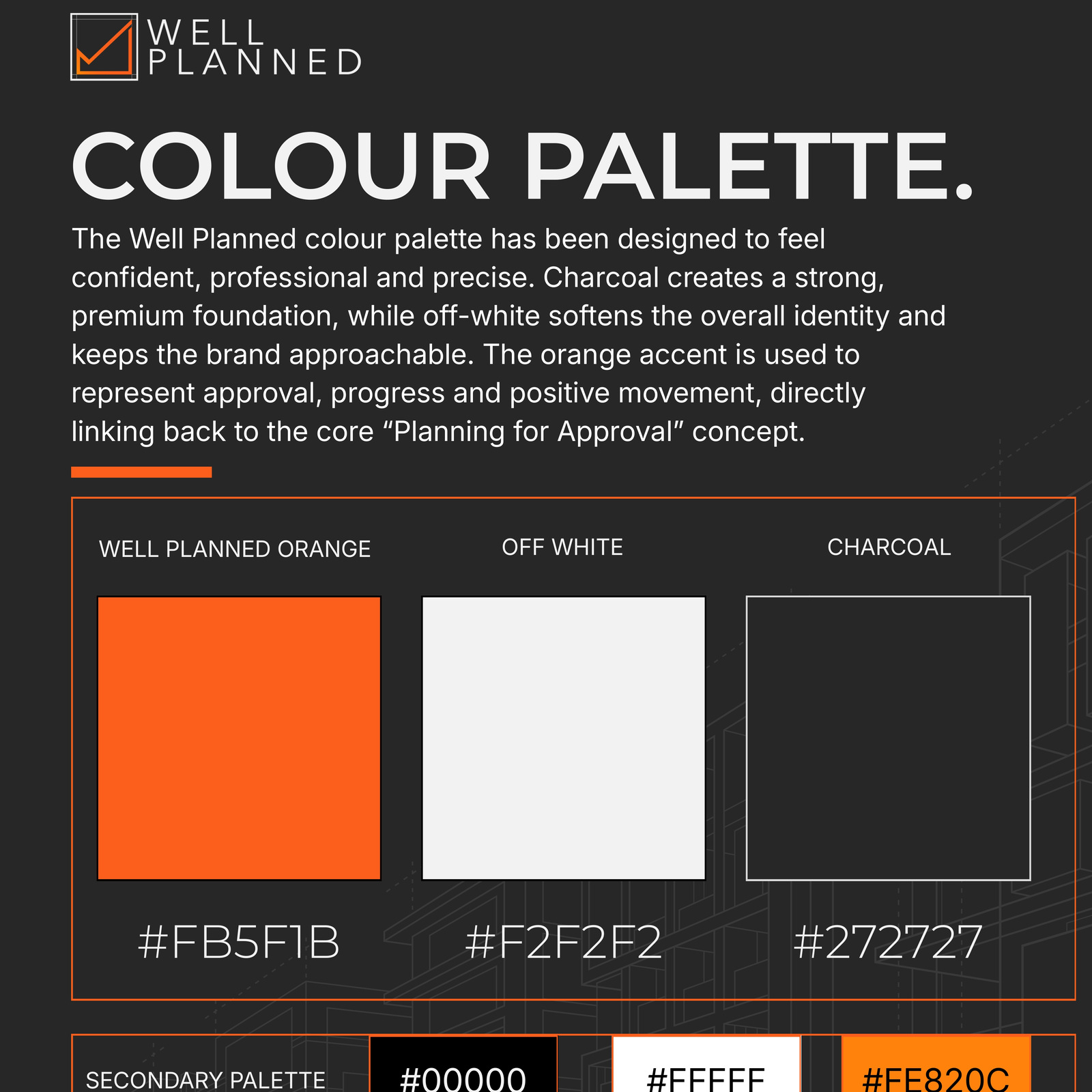
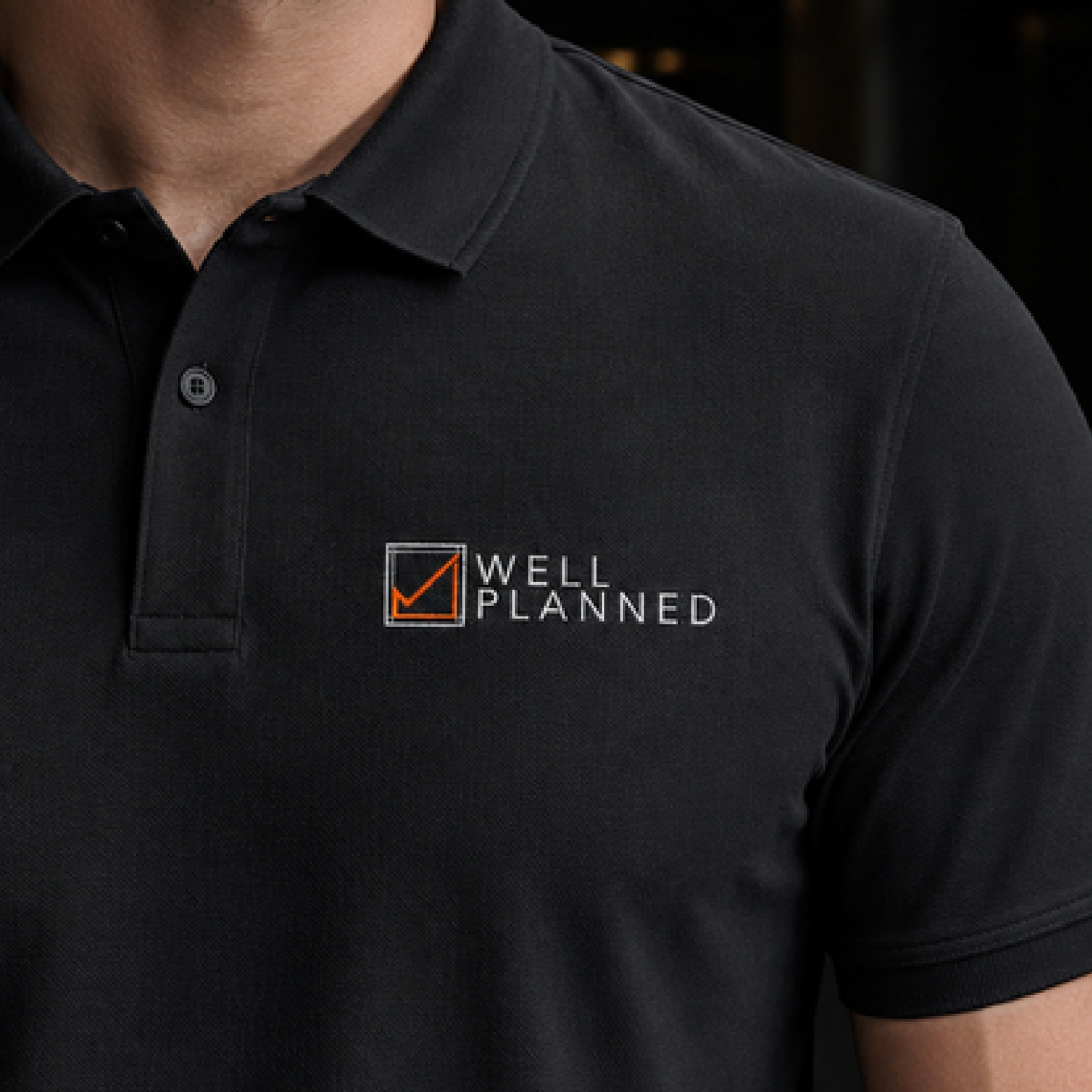
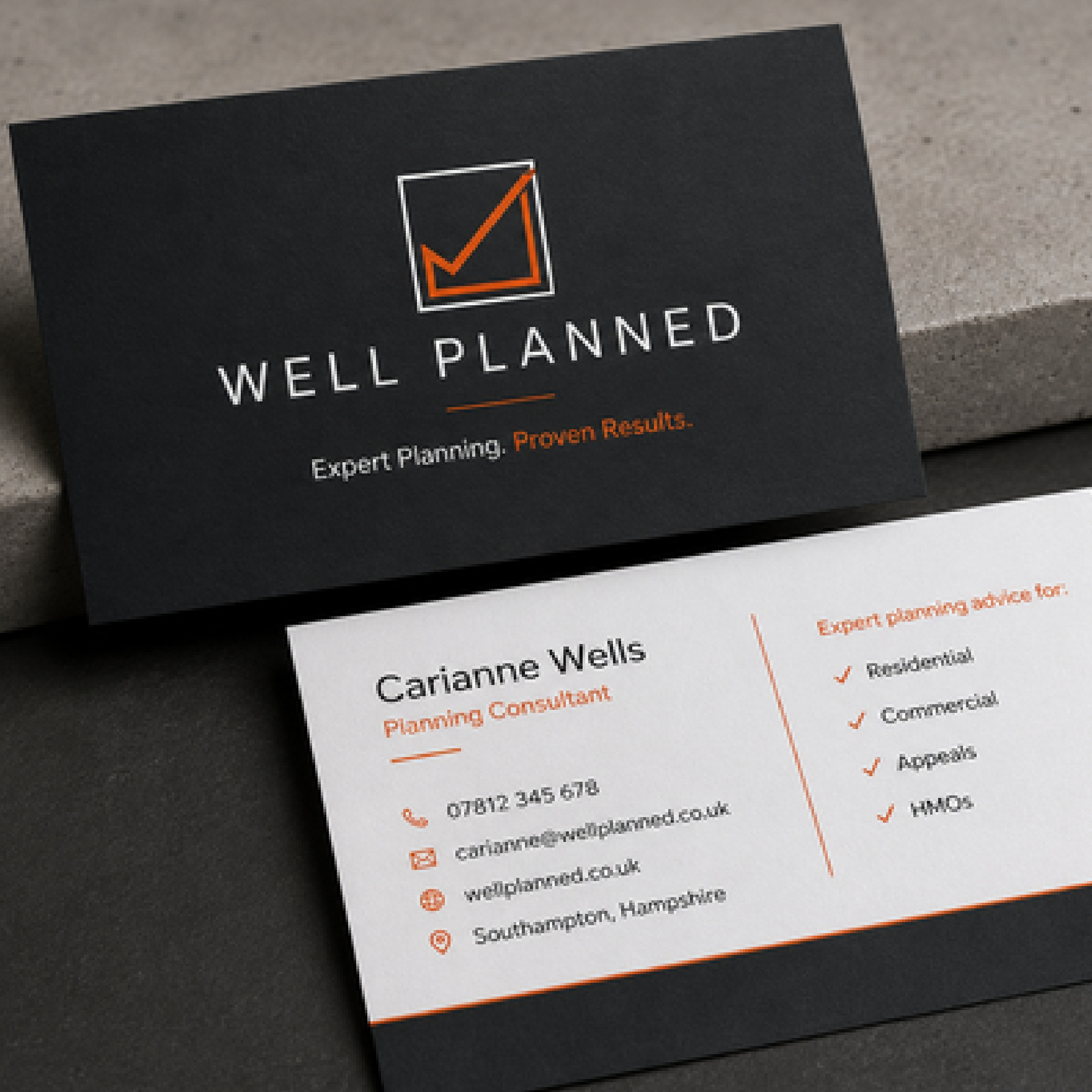
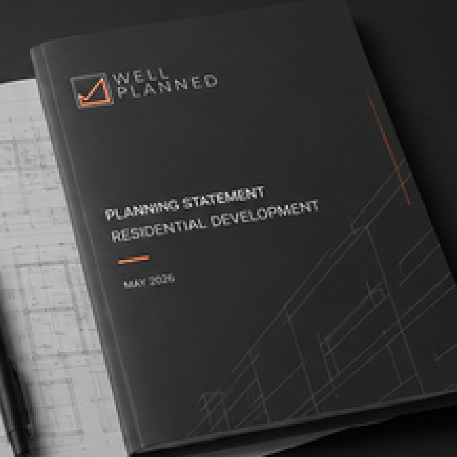
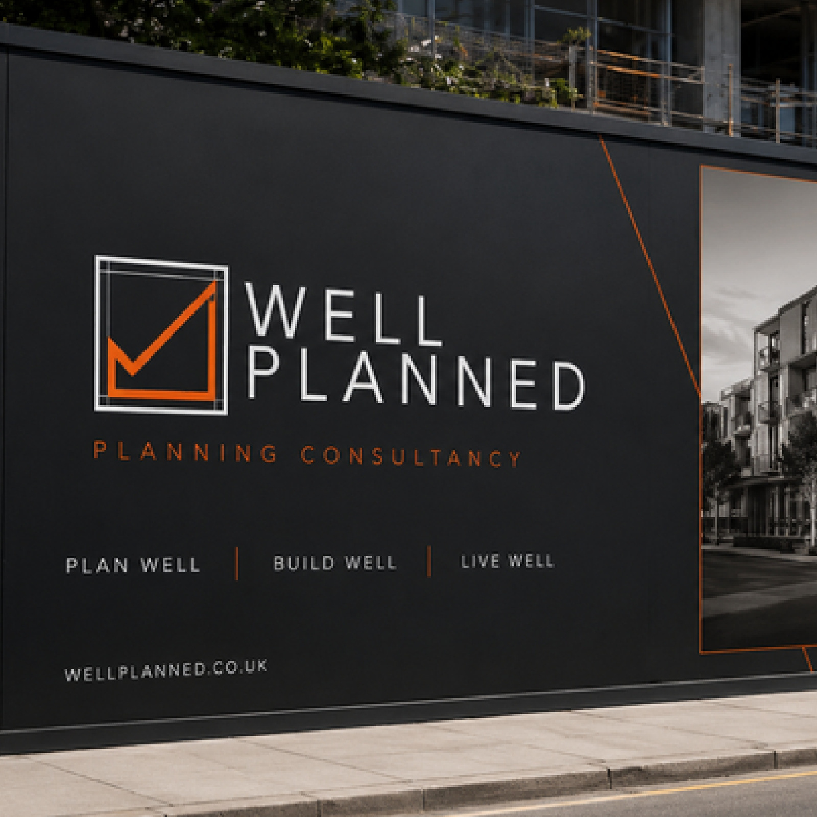
Stationery, signage, reports and site documentation all draw from the same small set of rules — so the identity reads as one consistent system rather than a logo applied inconsistently across a dozen touchpoints.

04 — Digital
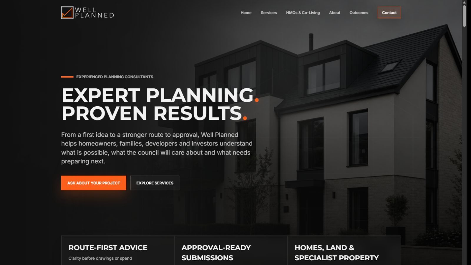
A digital presence that matches the advice behind it.
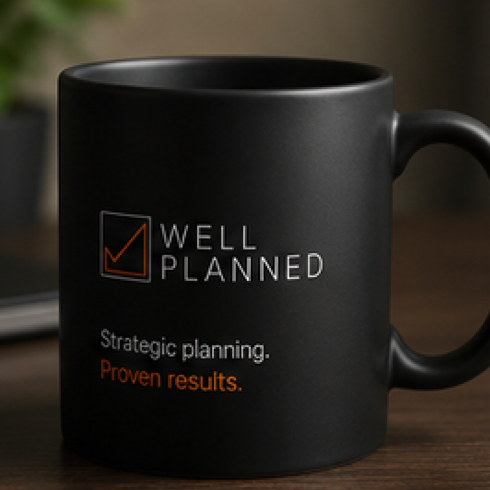
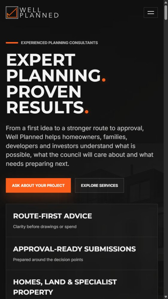
The rebuilt site puts the same clarity to work online: a confident, professional tone that simplifies complex planning matters without ever talking down to the client, structured around the questions a homeowner, developer or investor actually has before they get in touch. The result is a brand and a website that read as exactly what Well Planned is — experienced, strategic and reliable.
Present Form took the time to properly understand how our business works before they touched a single visual. What they've built doesn't just look sharper — it reads exactly as we are: experienced, precise and ready for the next stage. Clients trust us faster because the brand finally matches the standard of the advice behind it.Carianne Wells Founder & Planning Consultant, Well Planned
05 — The outcome
A brand and website that read as exactly what Well Planned is.
Clients now meet a Well Planned that looks like what it has always been — experienced, precise and ready for the next stage — before a single conversation has taken place.
06 — Live project
wellplanned.co.uk
Explore the finished website, or tell us what’s next for your business.