
Case study / The Scent Edition
Wildly Fragrant Homes.
A brand with a landscape
of its own.
A rebrand for The Scent Edition, designed to make the care behind its home fragrances visible before a customer experiences the scent.
01 / The challenge
Make the quality felt
before the first scent.
The products had care and character behind them. The identity needed to communicate that quality to someone discovering the brand for the first time.
The brief called for a distinctive, sensorial identity, readable packaging and clearer fragrance choice—with an atmosphere rooted in the outdoors.
02 / The direction
Living Landscape.
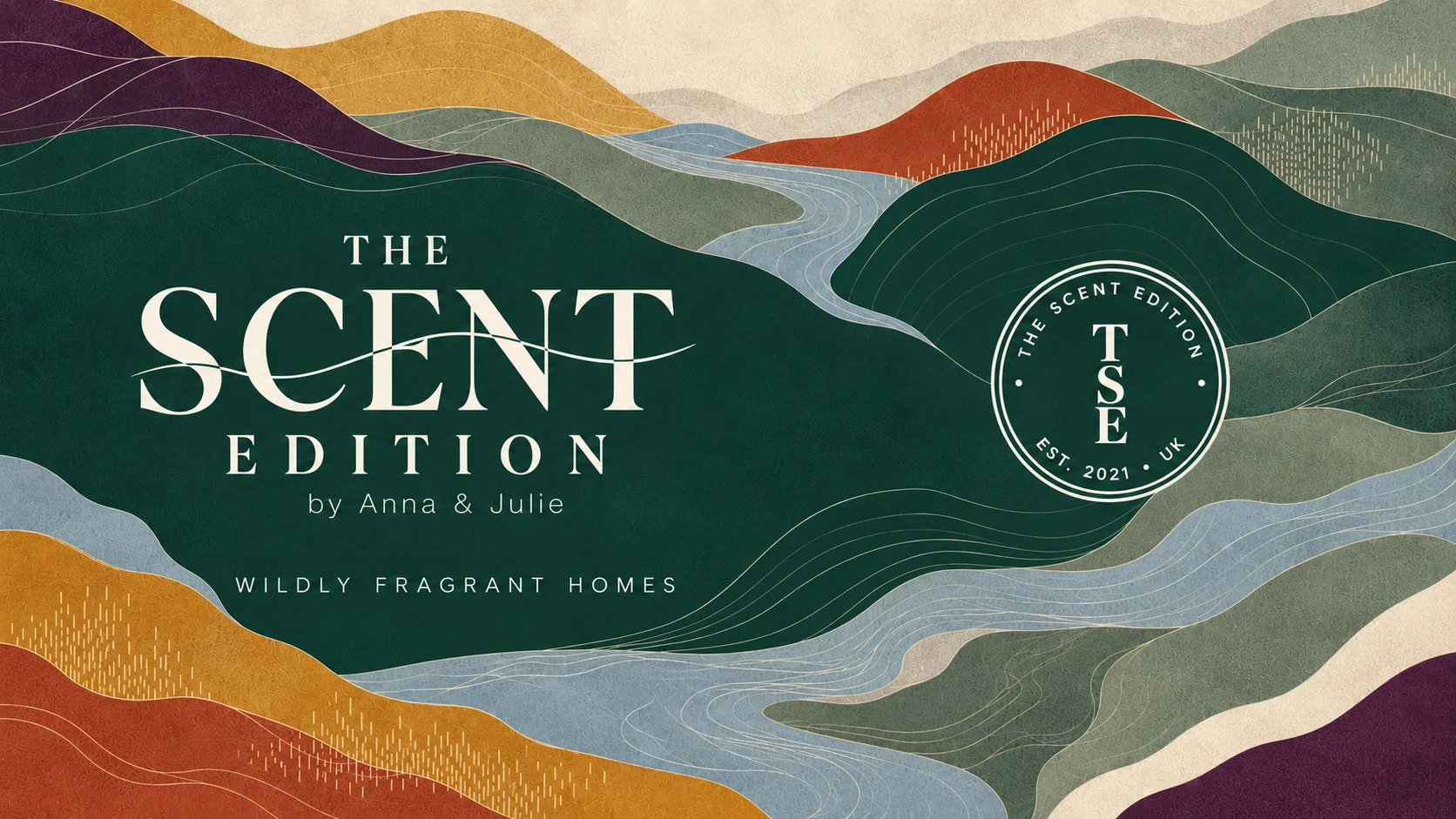
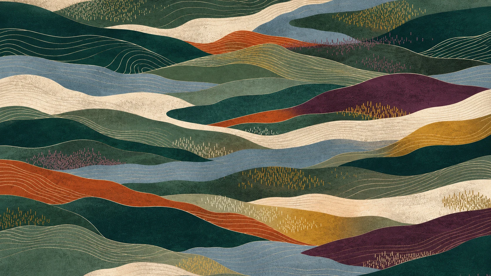
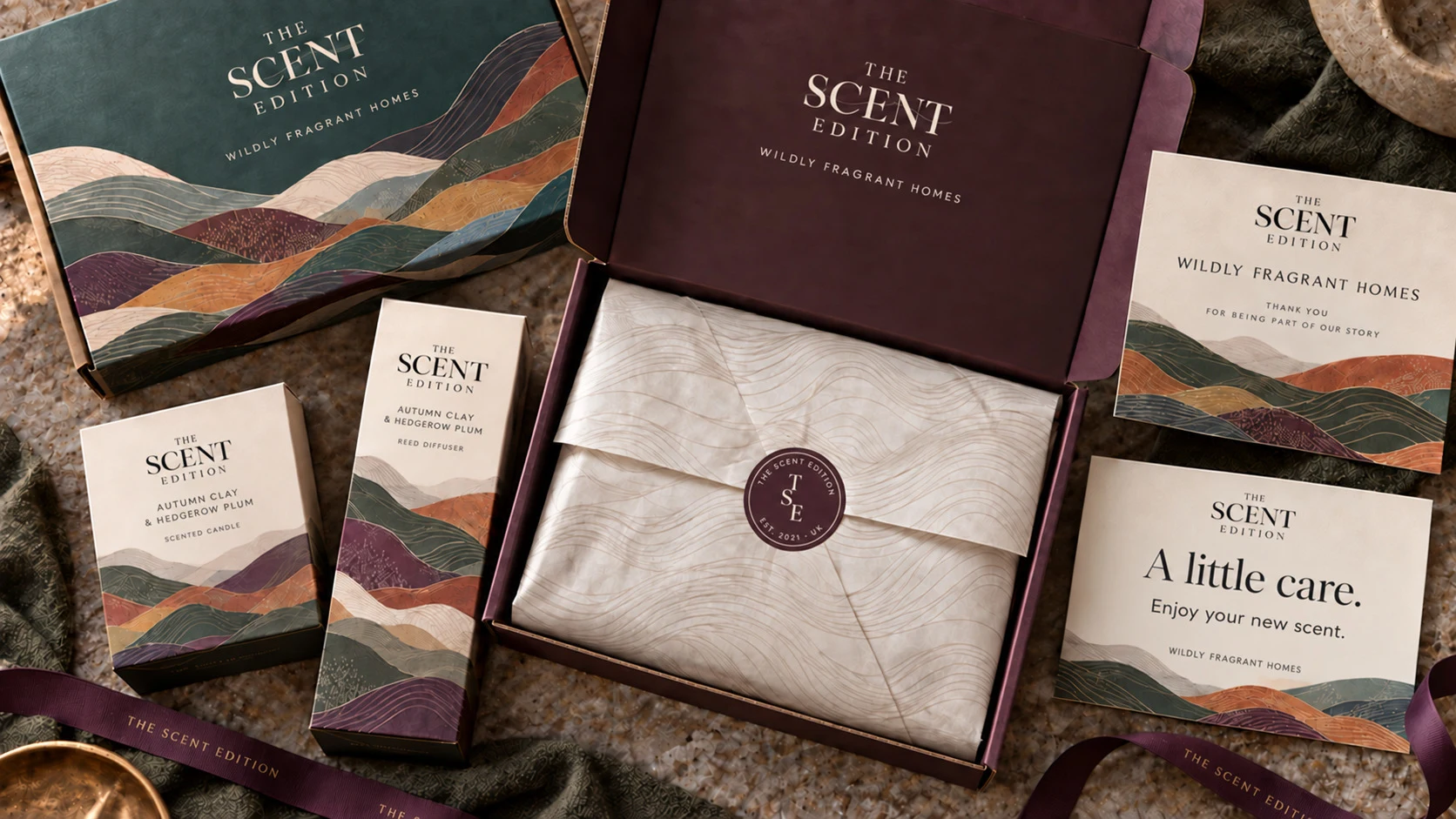
Flowing contours and layered landforms give the brand its own visual world. Deep forest and parchment anchor the identity, while plum, gold, ember and mist extend its expression across different fragrance moods.
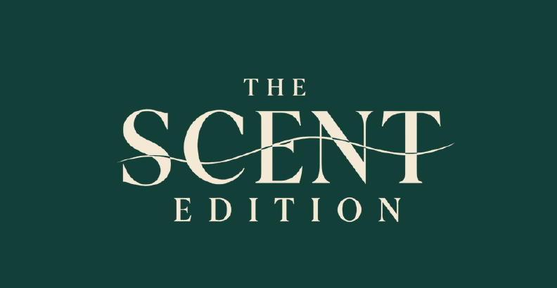
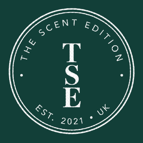
The crossing stroke in the wordmark echoes that flow. A circular, leafless TSE stamp gives the system a smaller companion mark for applications such as gift tags and seals.
03 / A considered system
One identity.
Room for every expression.
The palette keeps recognition consistent while allowing an individual accent to lead. Editorial typography carries the expressive side of the brand, with clear supporting type for practical product information.
“Wildly Fragrant Homes” brings fragrance, the outdoors and the home together in one supporting line.
Deep forest
#123F38Parchment
#F4E9D4Mist
#667A83Hedgerow plum
#43213FHarvest gold
#D4941BEmber
#C94F2004 / The identity in use
Designed to be pictured
in the real world.
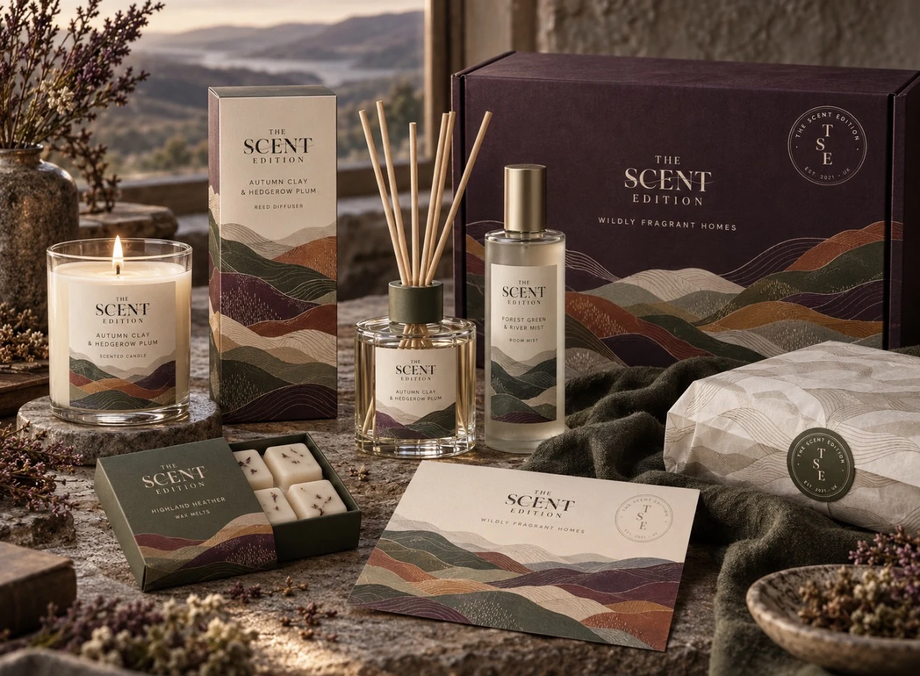
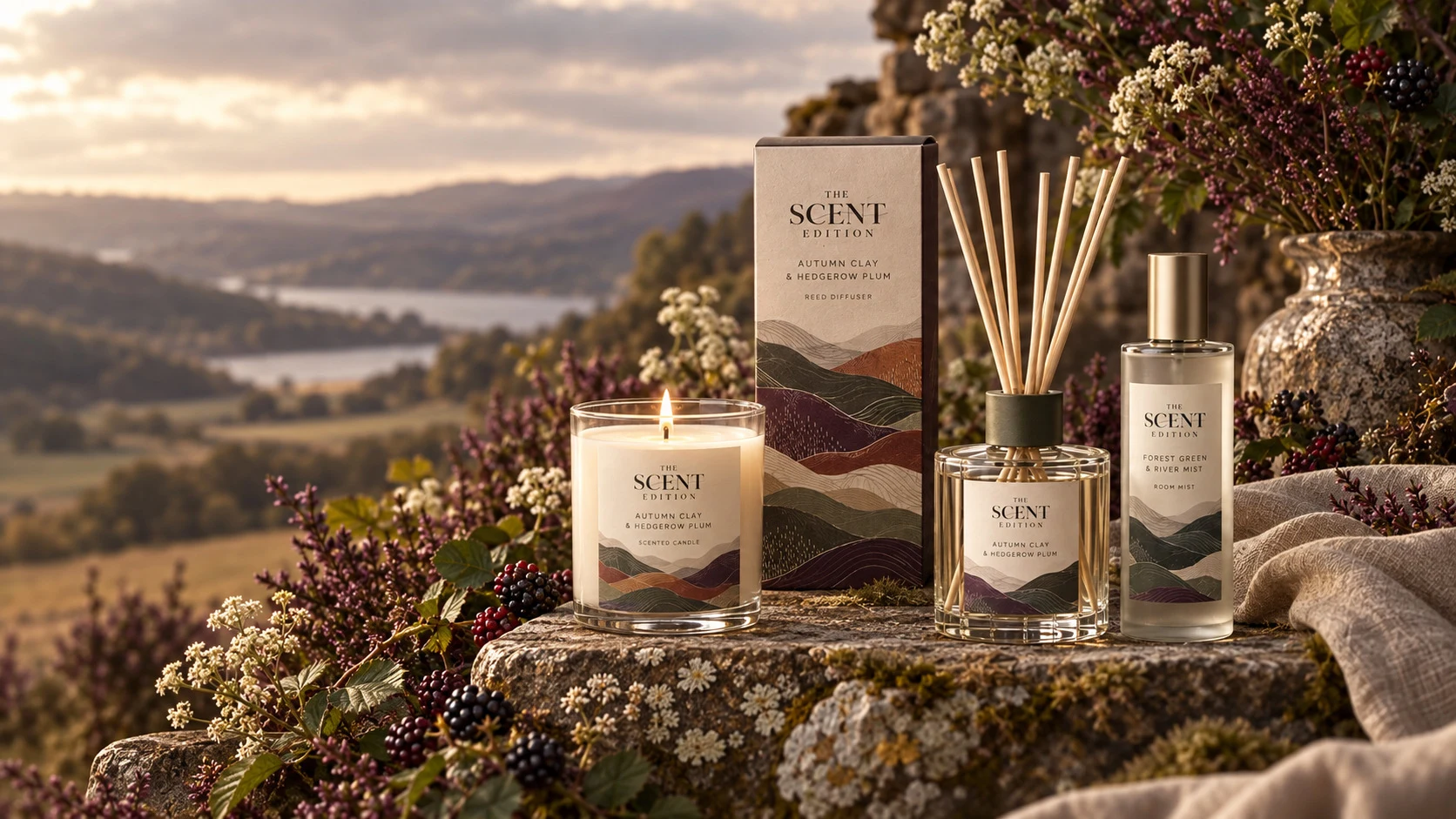
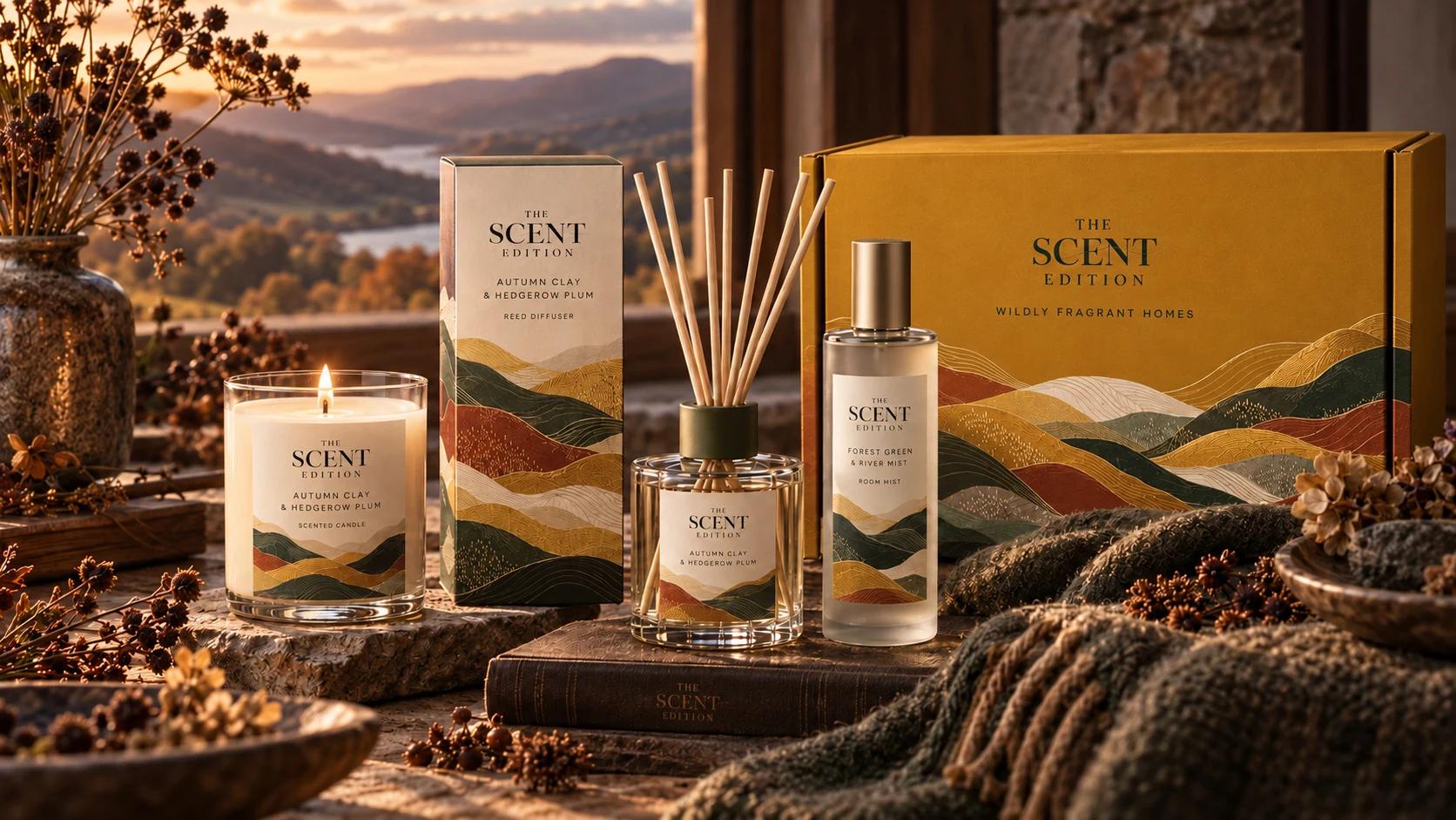
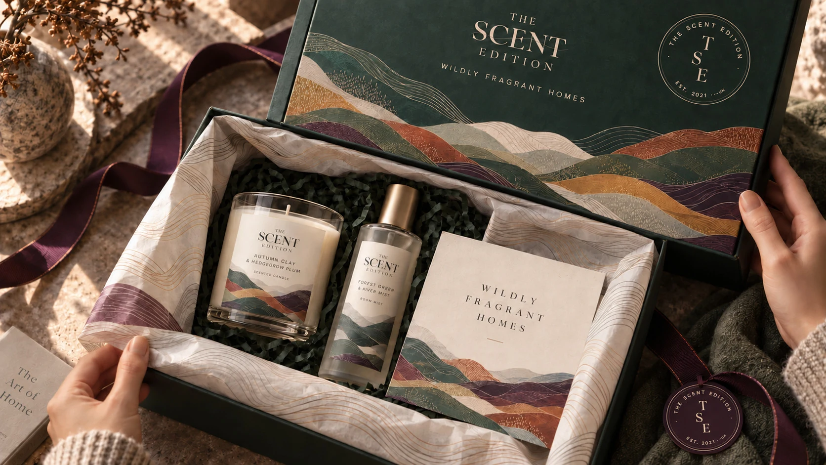
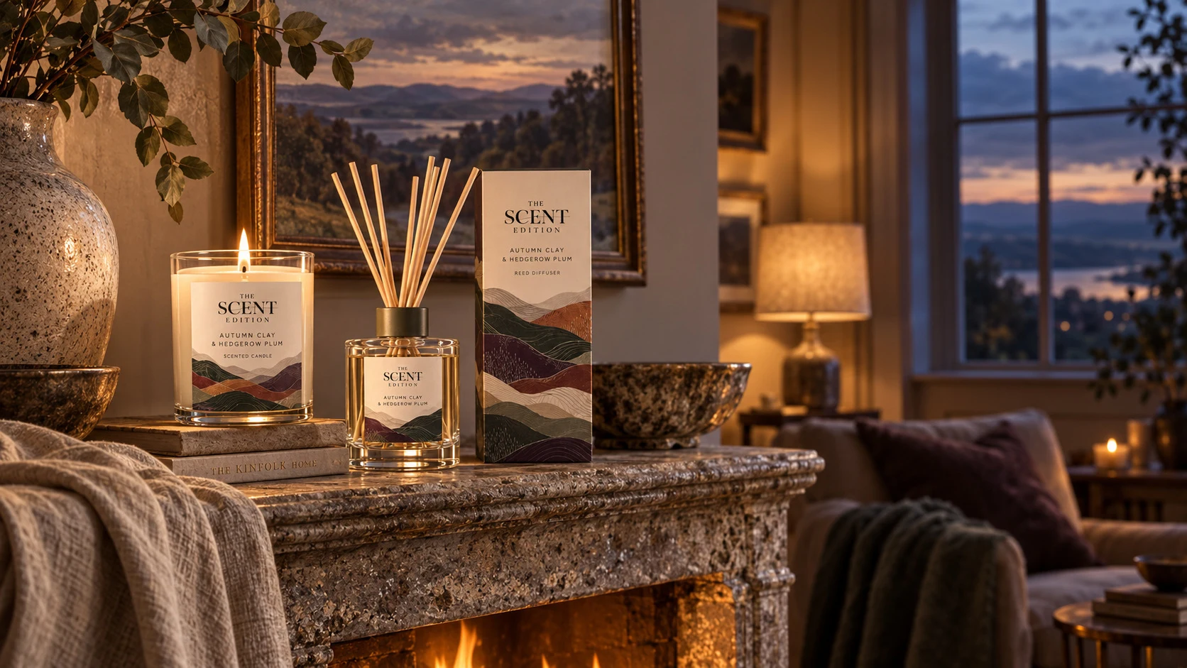
Packaging and gifting visualisations helped show how the rebrand could work beyond a logo: across individual products, a wider collection, and the experience of opening a gift.
These are design visualisations supplied in the project presentation, including AI-generated imagery. They show proposed brand applications, not photographs of manufactured products. Product names, vessels and finishes are illustrative.
05 / The client’s experience
We wouldn’t hesitate to recommend Ben to another small business looking for someone who will listen, explain the process clearly and work with you to create a brand that really feels like yours.AnnaCo-Founder, The Scent Edition
Read the full testimonial
We’re absolutely delighted with the rebrand Ben created for The Scent Edition.
From the beginning, he really took the time to understand our business, what was important to us and what we wanted our brand to represent. He gave us different options to consider and clearly explained the thinking behind each one, including the pros and cons, which made the whole process feel very collaborative.
Ben was also really receptive to our feedback, making changes along the way until everything felt right. One of the things we particularly appreciated was how he visualised the branding in real-world settings, showing us how it would look across our packaging. It made it so much easier to picture the finished brand rather than just looking at a logo on a screen.
We’re now in the process of changing over our packaging and preparing to launch our new website, and we’re genuinely excited to see everything come together.
We wouldn’t hesitate to recommend Ben to another small business looking for someone who will listen, explain the process clearly and work with you to create a brand that really feels like yours.
Is your business better than it looks?
Let’s make sure the first impression reflects what’s behind it.